Making a couples app worth coming back to
Redesigning Jino around retention after its first beta
v2 in build
- Timeline
- Aug — Oct 2026
- Team
- Product DesignerEngineer
- Skills
- Design SystemPrototypingProduct StrategyQA Testing
Overview
Introducing Jino
A daily app for couples who are both building big lives.

Problem
Some relationships fail because couples struggle to balance ambition with emotional presence.
Self-optimization often comes before relationships, yet ambitious people want a partner who supports their growth.
User research
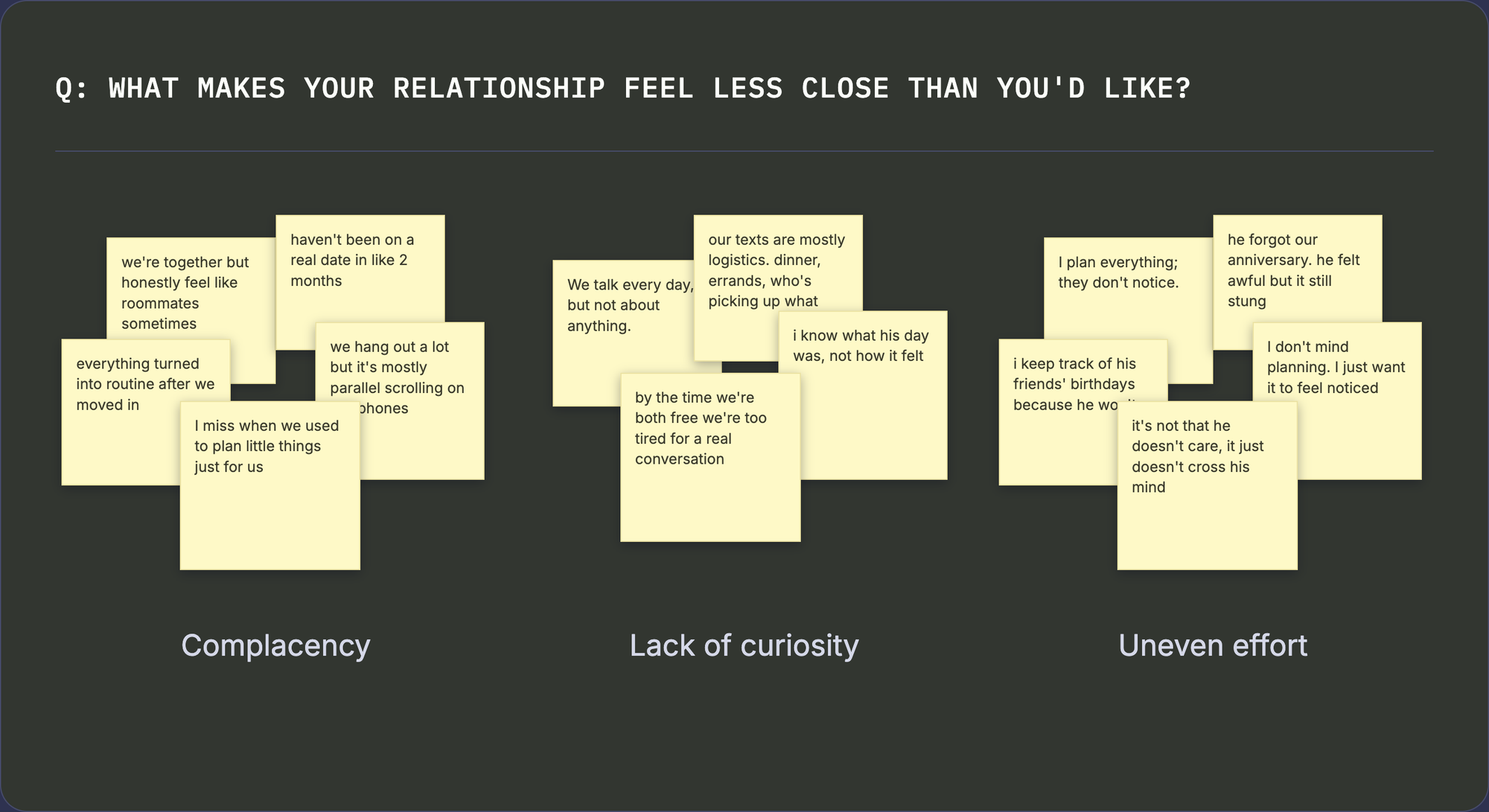
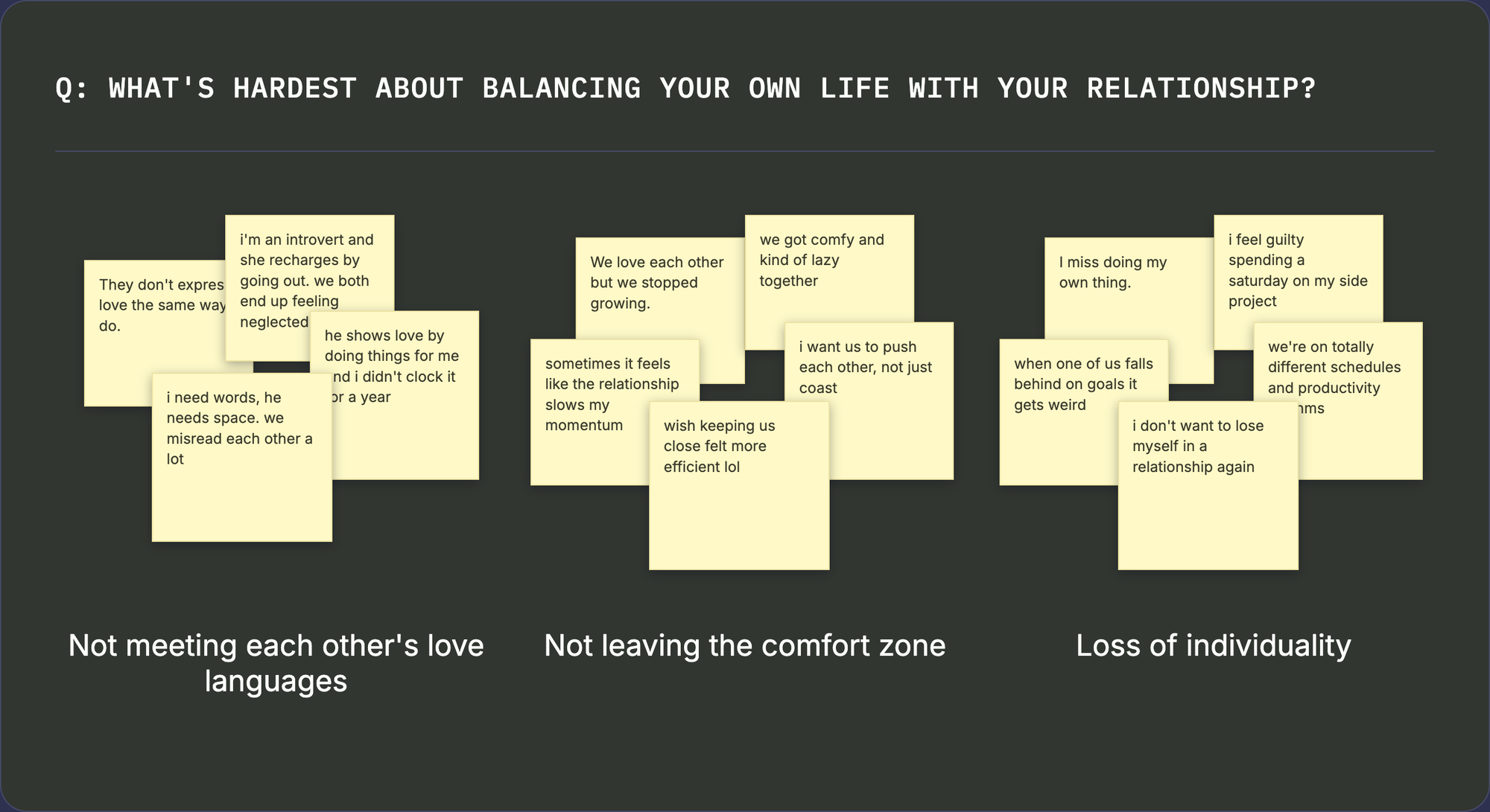
Couples drift apart in six predictable ways
From interviews with 3 couples, reviews of existing apps, and Reddit threads.
Post-honeymoon drift
“We're together but feel like roommates.”
Lack of curiosity
“We talk every day, but not about anything substantial.”
Uneven effort
“I plan everything; they don't notice.”
Love language gaps
“They don't express love the same way I do.”
Stuck in comfort
“We love each other but we stopped growing.”
Loss of individuality
“I miss doing my own thing.”
How might we…
“…help ambitious couples stay emotionally close through low-effort daily rituals, without asking either partner to shrink their individual life?”
Strategy
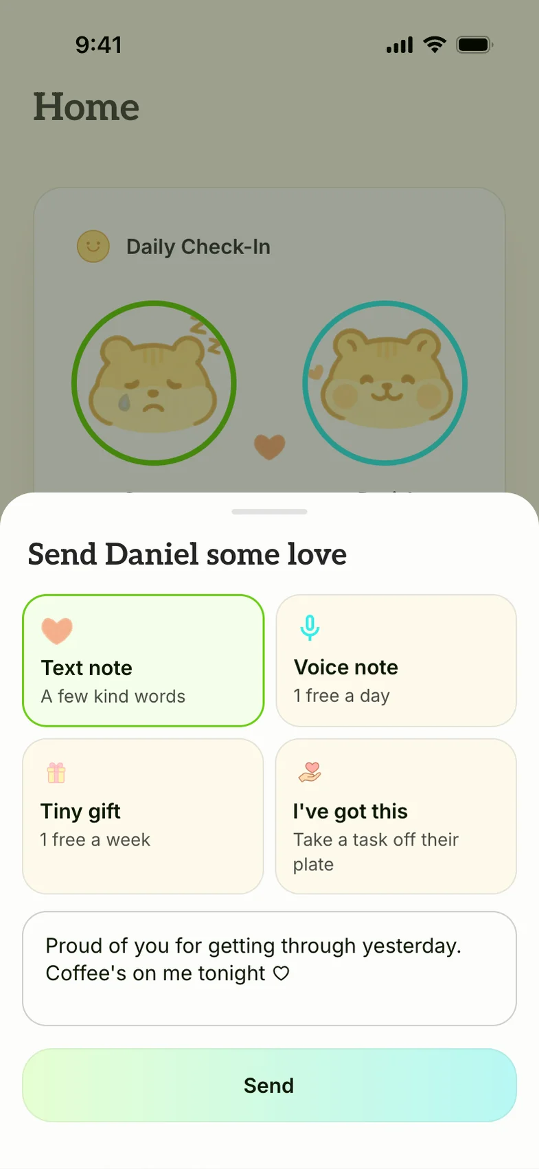
Daily rituals, not another couple diary
Most of the roughly 10 competitor apps I reviewed were diaries or journal prompts, so I built around behaviors instead.
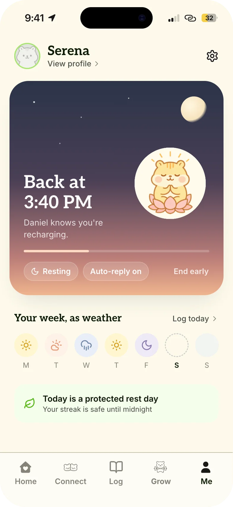
1 / 4
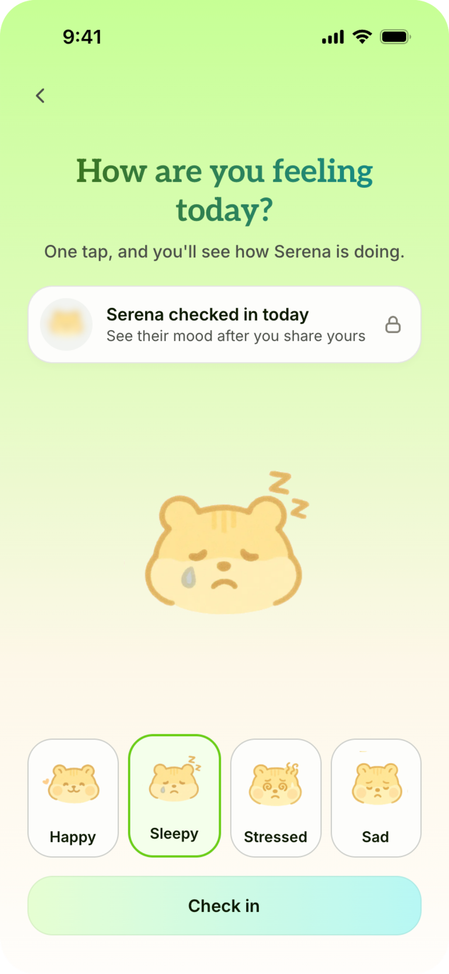
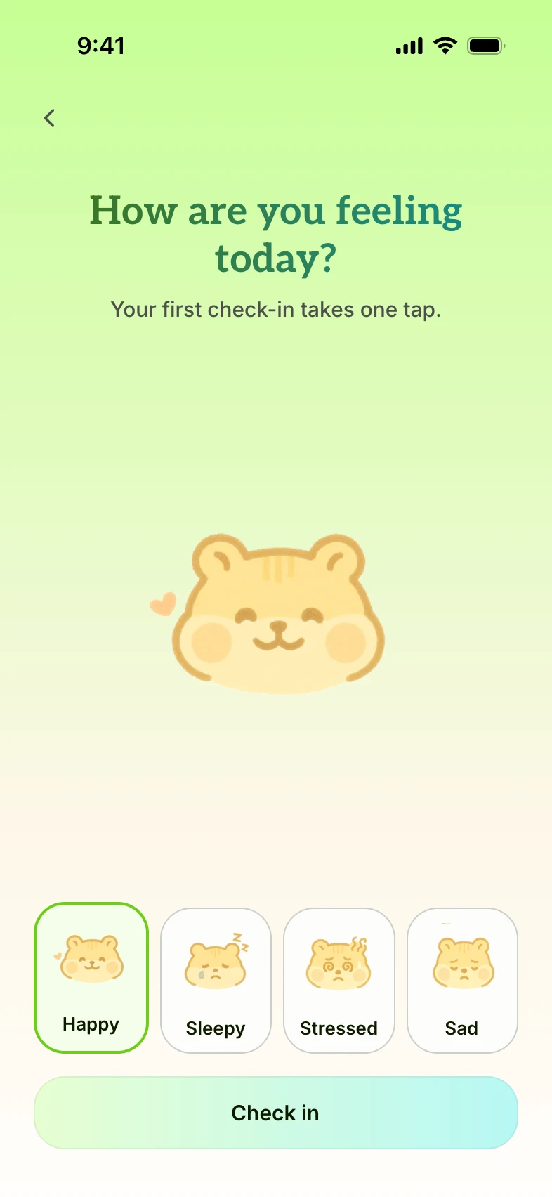
Check in
A one-tap daily mood check-in.
Initial design
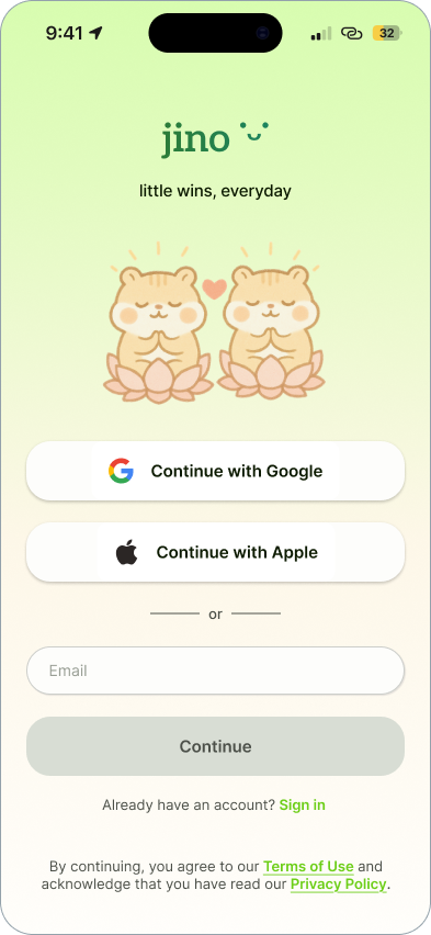
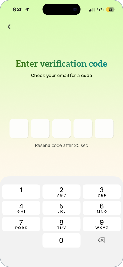
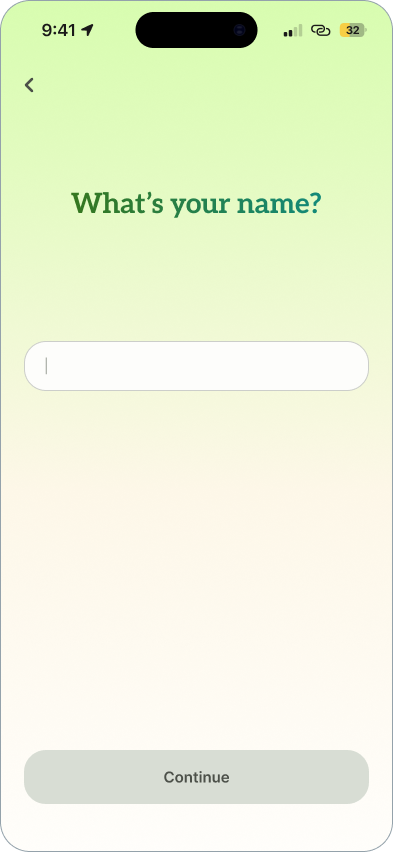
Version 1 was built to be easy to start
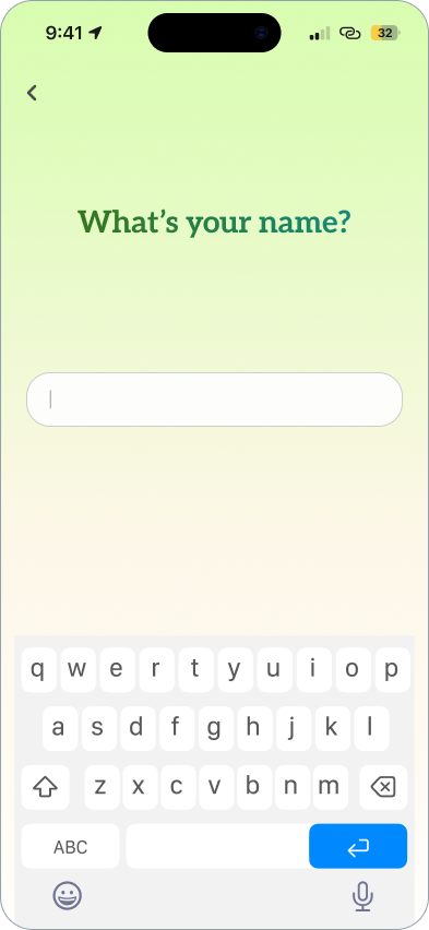
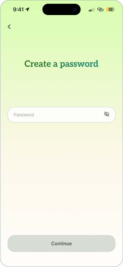
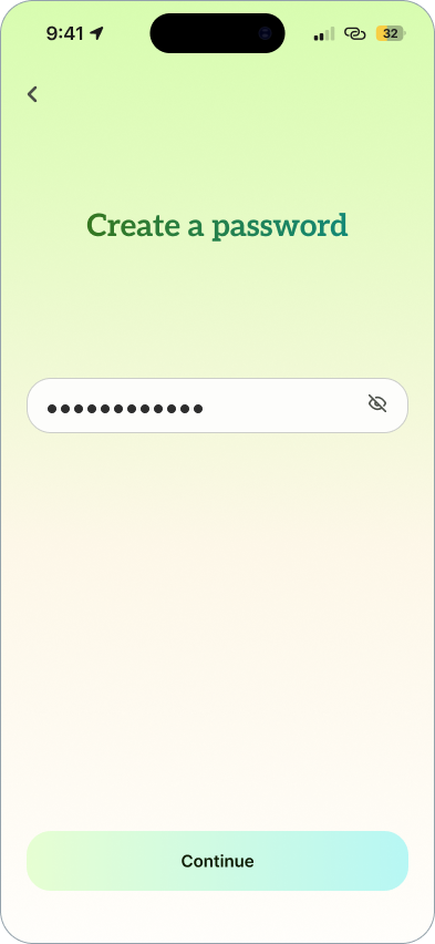
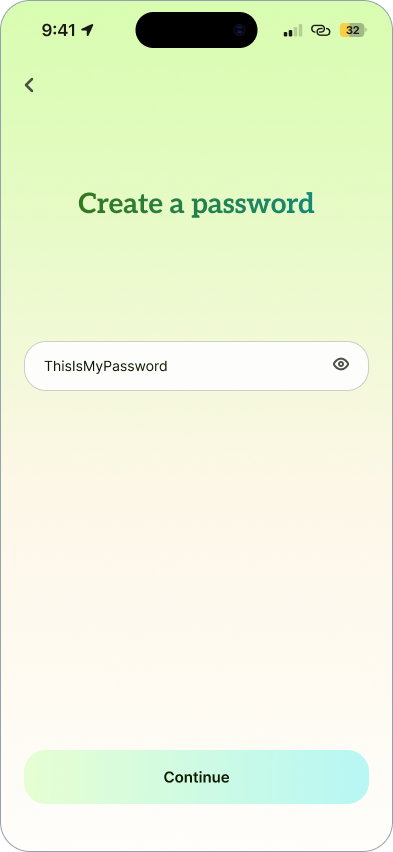
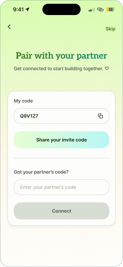
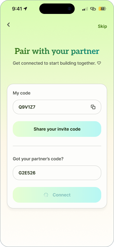
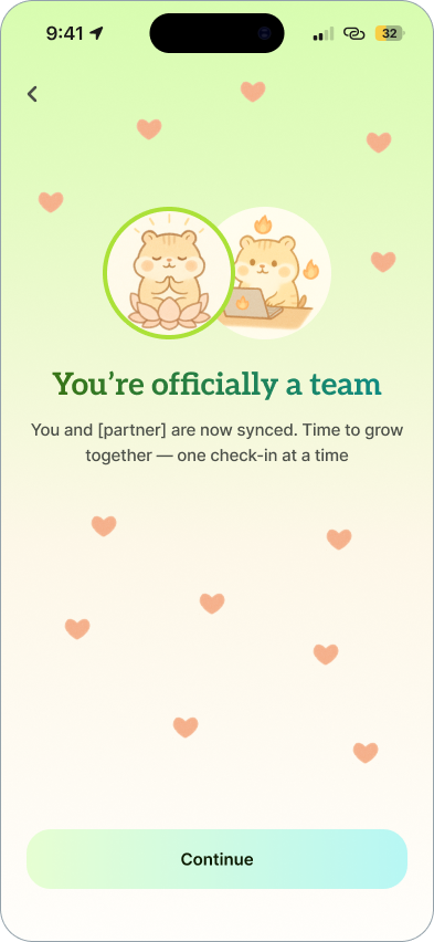
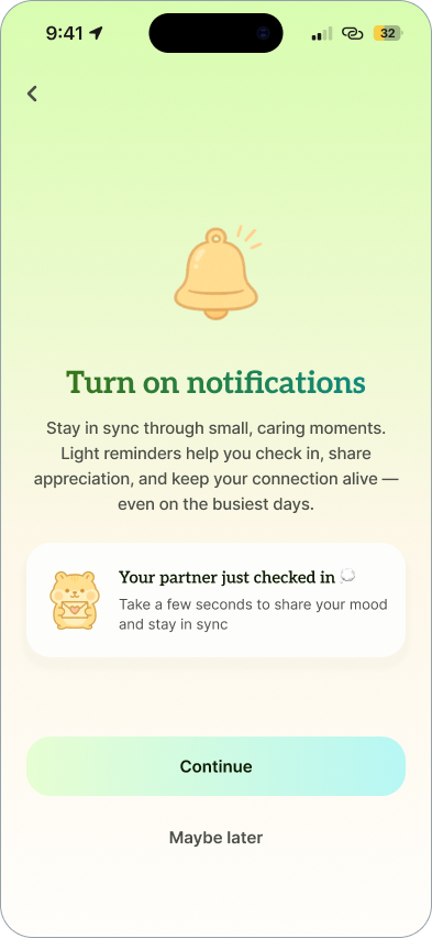
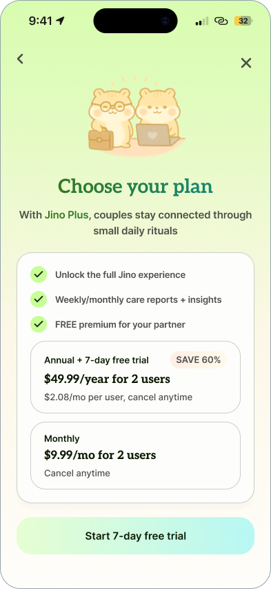
I prioritized social logins, < 5 sign-up screens, and empty states that reduced time-to-value. However, I hadn't tested whether partners would pair and come back.
Testing
The beta showed people loved Jino, then stopped using it
I opened Jino to three couples on September 22 and tracked use in PostHog, a usability survey and an interview with each couple.
Three couples is a small group, so I read this as a signal, not a verdict.
What the testers told me
Pairing broke the first session
Pairing needed both partners at the same moment, and the code expired.
Nothing pulled people back
Reminders came too late, and one partner did most of the work.
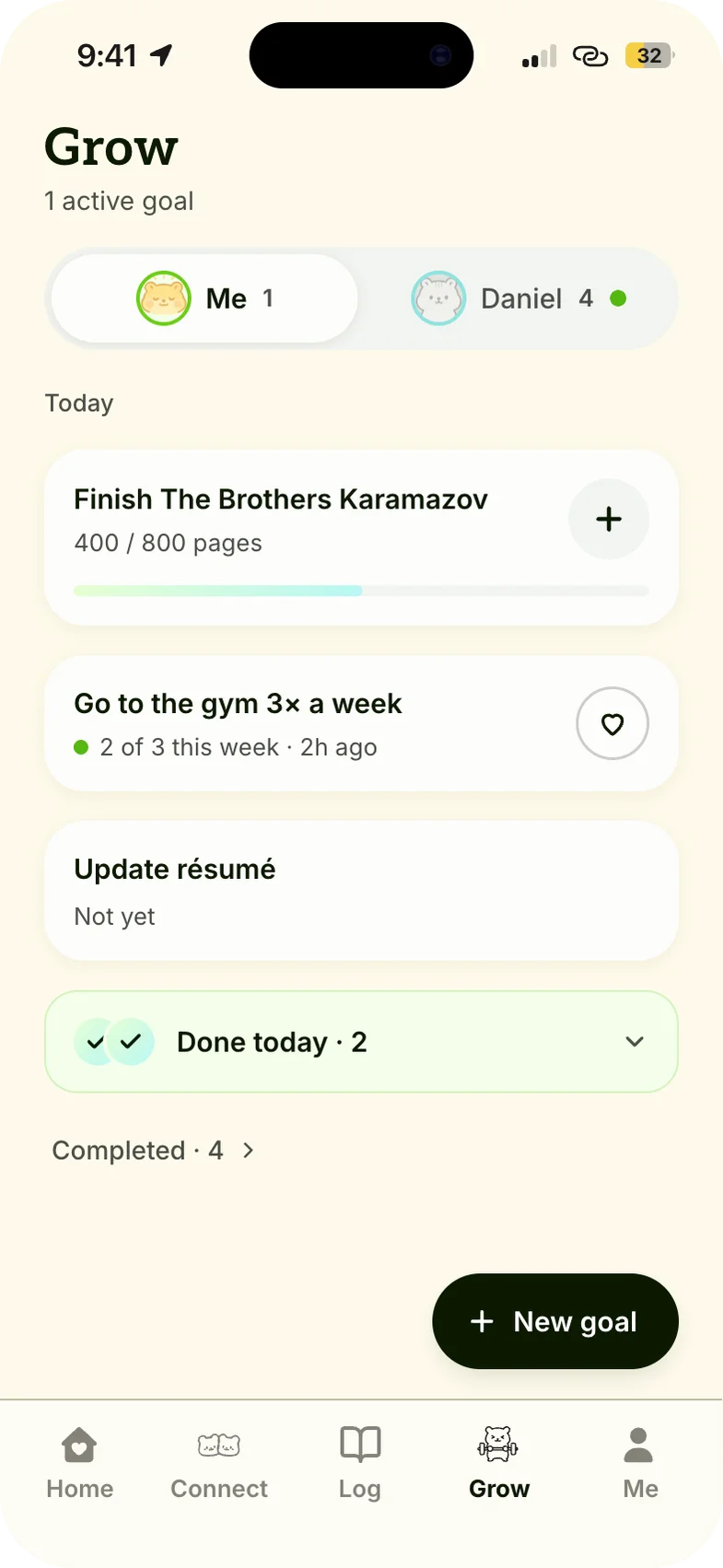
Goals felt like a solo to-do list
Testers called it a to-do list for one.
Design decisions
Bringing users back everyday for v2
Should a new couple create an account before or after their first win?
A one-tap first check-in, then sign-up. Inviting your partner is skippable. Pairing needed both partners at the same moment, so the first session has to pay off on its own.
Option A: sign up first
What v1 asked for first: an account, then pairing.
Option B: check in first
What v2 asks for first: how are you feeling?
How does the less active partner join in?
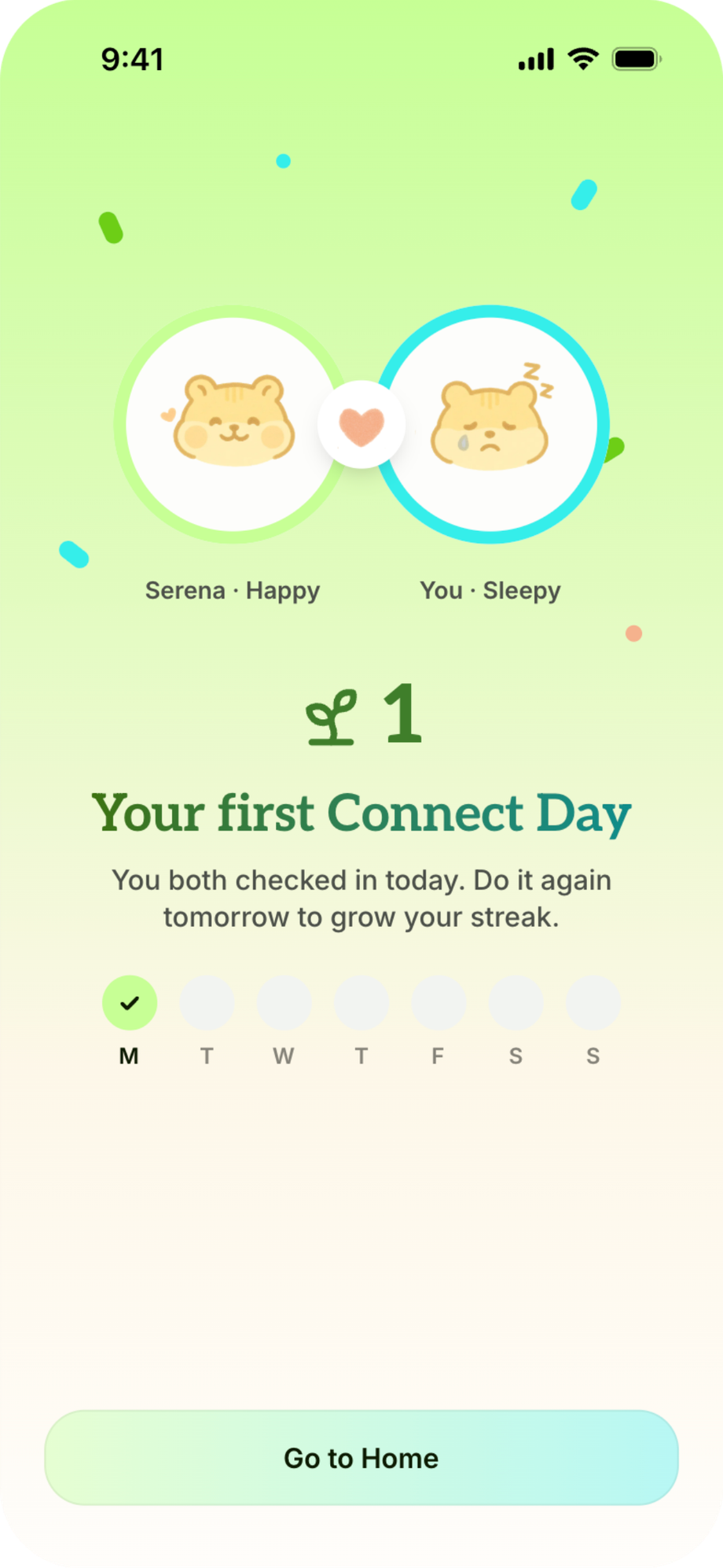
Your partner's mood stays locked until you check in, and widgets and pushes bring you back to unlock it. In the beta, only 3 of 32 notes and gifts got a response, and then all three couples stopped using the app. So the less active partner needs a reason to open it, not just an easier way to reply.
Option A: answer in the log
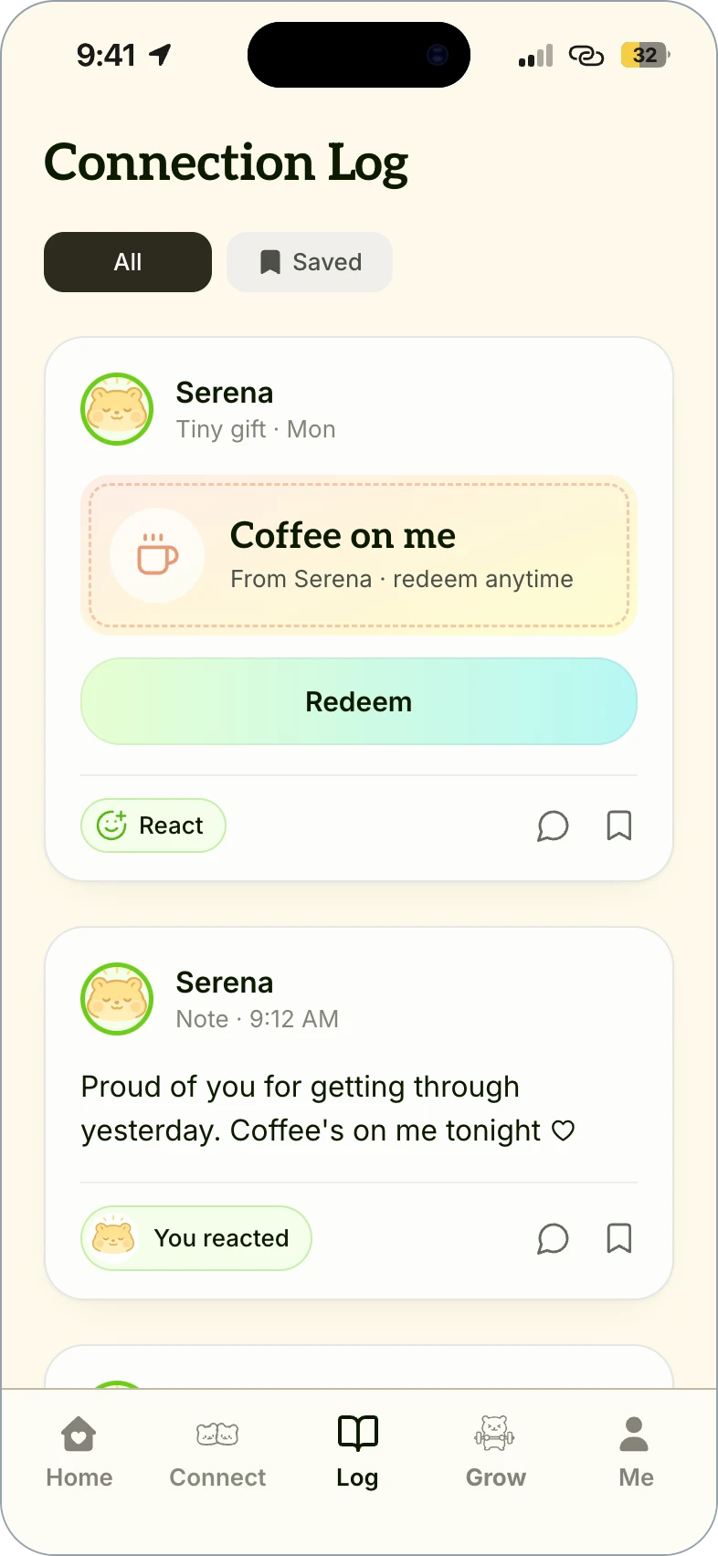
A log of gifts and notes the less active partner could answer in one tap.
Option B: lock their mood
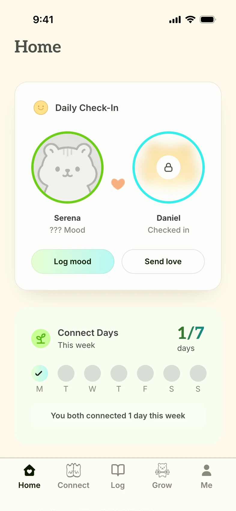
Your partner's mood stays blurred until you log your own.
How should you log progress on a goal?
Testers called Goals a solo to-do list. So tabs now show you and your partner at a high level, without scrolling down, and a “+” button lets you log any amount.
Option A: “+30” pill
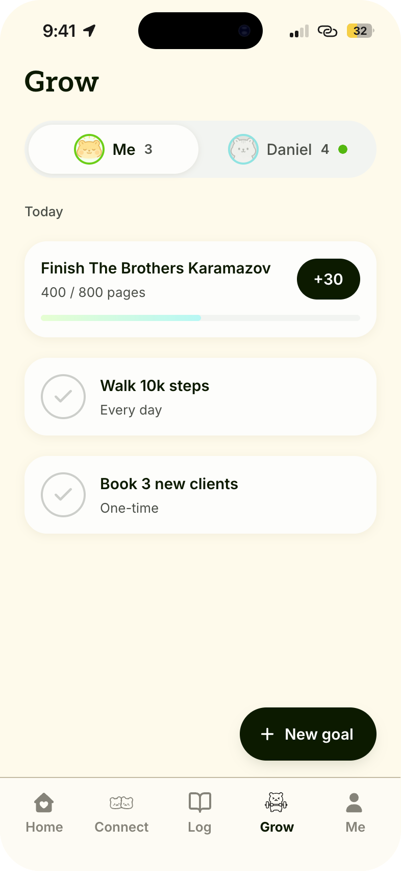
A preset amount on each progress goal.
Option B: “+” input
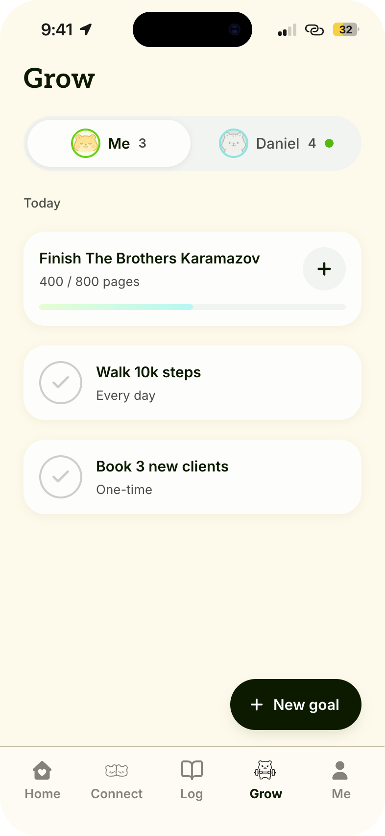
A “+” on each progress goal that opens an input.
Solution
A new way for couples to stay connected
v2 is in development, and success will be measured by D7 and D30 retention.
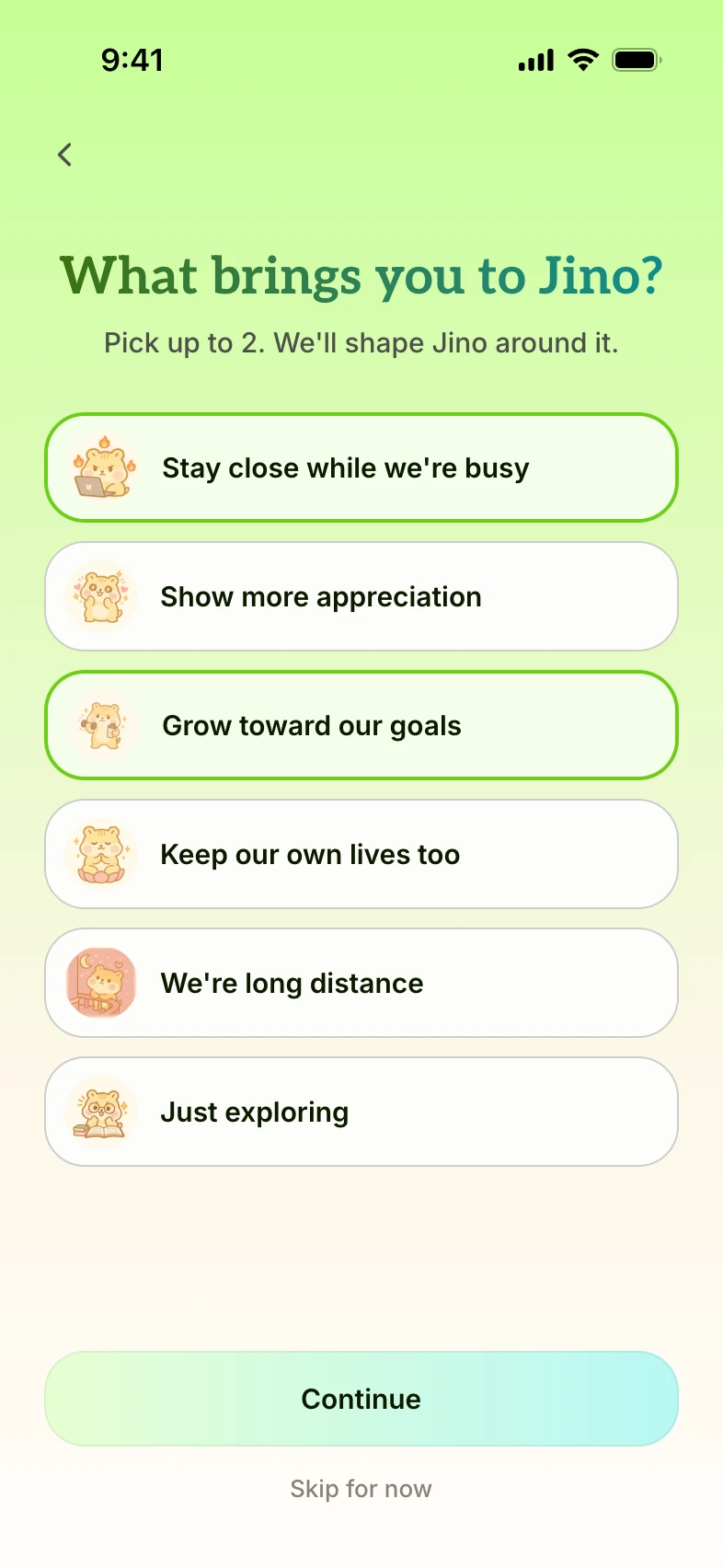
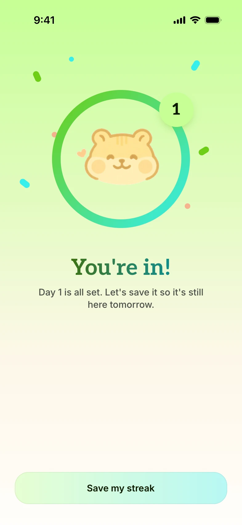
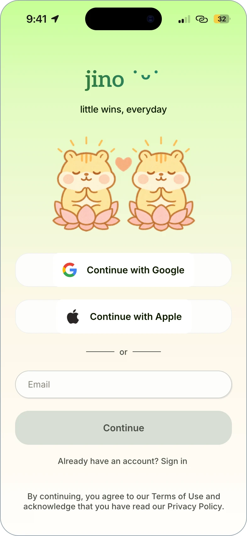
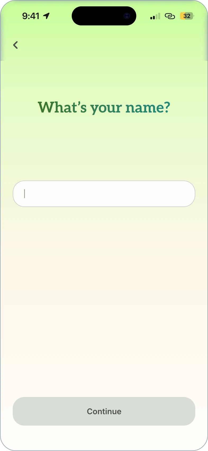
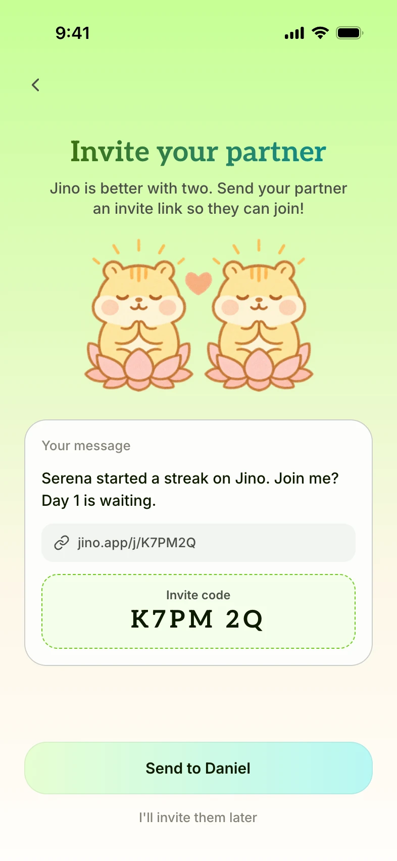
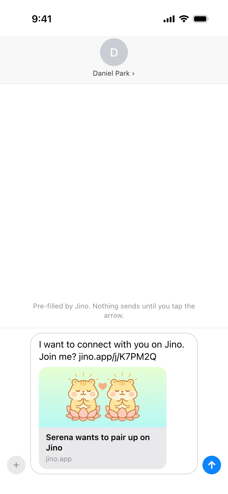
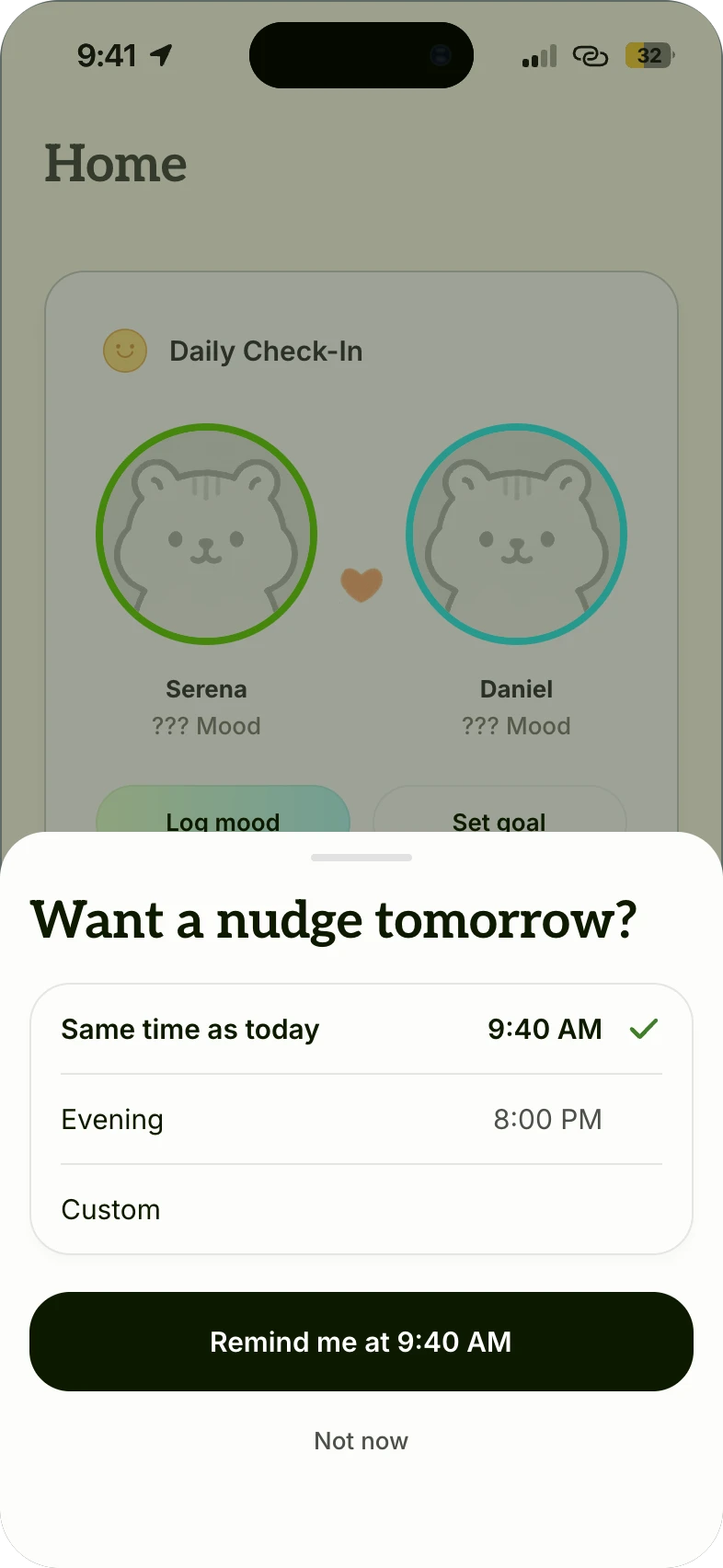
A first win before sign-up
Delivering immediate value through onboarding check-in and push notifications
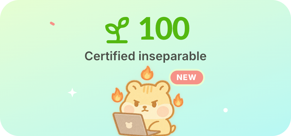
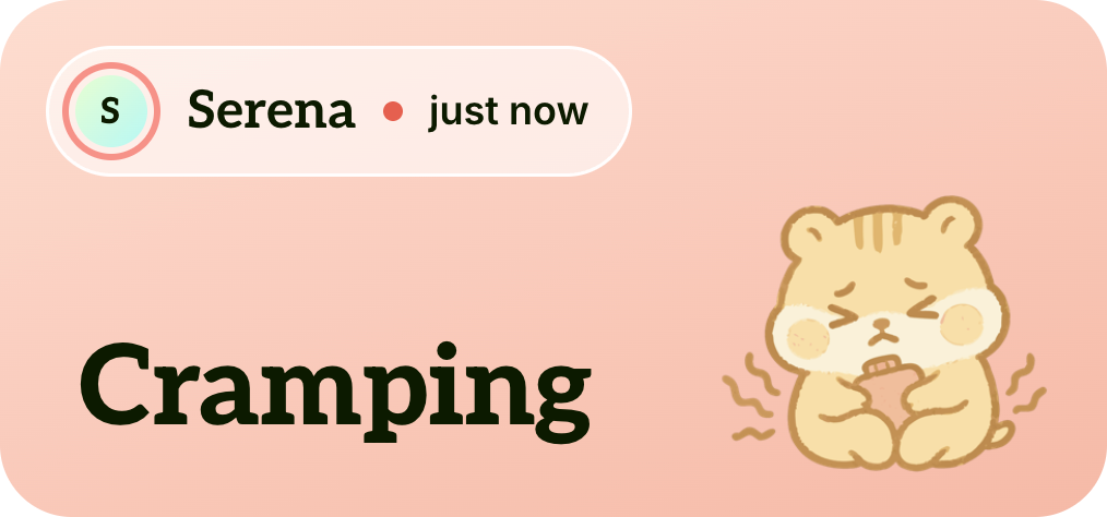
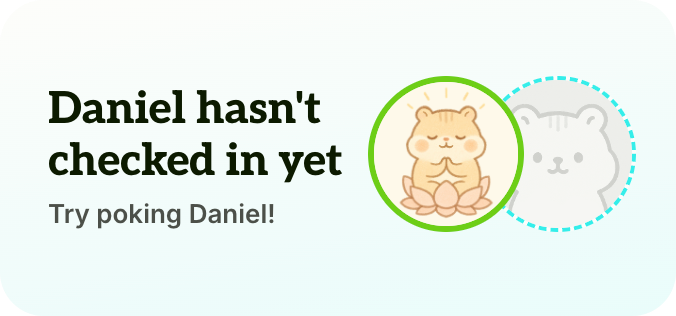
Widgets designed to bring both partners back
When your partner hasn't checked in, the widget suggests a poke to maintain the streak.
Reflection
A daily loop needs reinforcing to stick
Beta testing showed that the behavioral loops died as soon as the novelty did. For consumer apps, push notifications, widgets and more urgent streak mechanisms are what close the loop, and each one reminds and incentivizes users to come back. Whether they make it stick is what the beta will measure.